
Here’s a fun fact.
According to research conducted by KissMetrics, the customer lifetime value for Starbucks was calculated at an unbelievable $14,099. Surprising for a brand whose products are usually under $10, right?
The truth is, Starbucks’ has been around for decades. Since 1971, to be accurate. And in all this time, customers who once entered their store for the first time have returned again, and again, and again.
Now, this isn’t an article to promote Starbucks’, so we’ll leave it at that.
But the idea is… what if your current customers are actually worth much more than you think? Wouldn’t that change your customer acquisition strategies?
Unfortunately, a lot of brands and marketers overlook their customer lifetime value in their customer acquisition efforts and focus exclusively on metrics such as ROAS, or CPA.
Don’t get me wrong, these are great metrics. But what if there was a better alternative?
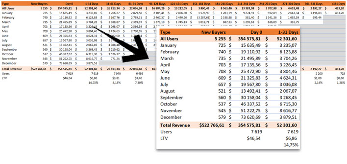
In this article, we’ll cover how to calculate your customer lifetime value with free tools, and how we can create a table like the one below, so you can really understand your target acquisition costs and scale your campaigns accordingly.
This will be a long article, so grab a cup of coffee and let’s get into it.
What is Customer Lifetime Value?
Customer lifetime value stands for the total revenue each customer will generate over the course of their relationship with your brand.
In other words, it stands for how much money each customer is expected to spend in your business in their lifetime.
But what does “lifetime” mean, exactly?
Now, this is where most marketers hit a wall when it comes to customer lifetime value. How do I know how long customers will stick around? In Starbucks’ case, since the brand has been around for a few decades, it’s easier to make these calculations based on previous data.
But what if you’ve only been in business for a few months?
Before we answer that, let’s take a look at the traditional way to calculate customer lifetime value (LTV).
How to Calculate Customer Lifetime Value
To calculate your average customer lifetime value, you’ll need these four metrics.
- Average Order Value
- Purchase Frequency
- Churn Rate
- Estimated Customer Lifespan
Once these metrics have been calculated, the formula for customer lifetime value is as follows.
CLTV = AOV / Purchase Frequency * Estimated Customer Lifespan
For now, let’s take a look at each one of these metrics in more detail so we can then dive into Excel and Google Analytics, and build our cohorts.
Average Order Value
The average order value stands for the average amount each customer spends each time they order from your website.
It can be calculated by dividing the total revenue generated in a given period by the total amount of orders placed.
Average Order Value = Total Revenue / Total Orders
For example, let’s say that in the month of January you had a total of 500 orders, for a total of $22,680. This would result in a $45.36 average order value.
Purchase Frequency
The purchase frequency stands for the amount of orders placed by each customer, in a given period.
To calculate your purchase frequency, take the total orders placed within a time period (the same used in your average order value calculations) and divide it by the total amount of customers who ordered.
Purchase Frequency = Total Orders / Total Customers
For example, if in the month of January you had 500 orders and a total of 382 customers, your average purchase frequency would be around 1.30 within that same month.
Churn Rate
In short, the churn rate is the rate at which customers stop doing business with you, over a given period of time.
If you have a 50% churn rate, it means that around half of the customers who buy from you eventually stop doing so, within a time period. There are some different methods to calculate the churn rate.
The most common one is to take the total amount of users lost within a time period, and divide it by the number of users at the beginning of that period.
Churn Rate = Customers lost in period / Customers at start of period
In other words, if you had 1,000 customers at the start of January and a 10% churn rate, it means you would’ve lost 100 users in that time frame.
Estimated Customer Lifespan
The last metric you’ll need for the calculations is the estimated customer lifespan.
Now, this is one of the hardest metrics to come around to since there are different methods to do so. We won’t cover them all since that’s not the point of this post.
But here’s the most common method to do it.
To calculate the estimated customer lifespan, you divide 1 by your churn rate. In the scenario above, it would mean that, on average, users stick around for 10 months.
Estimated Customer Lifespan = 1 / Churn Rate %
So what’s the issue with estimated customer lifespan? Isn’t that all it takes, then?
Estimated Customer Lifespan Kind Of Suc#$!
One of the murkiest metrics out there, estimated customer lifespan can mean different things, for different brands and business models.
Let me ellaborate.
Take a SaaS software and an online cookware store, for example. In the first case, it’s relatively easy to calculate the customer churn rate based on the number of customers at the start of the month, and at the end of it. You take the total amount of customers who left within that month, and calculate the churn rate.
You can then use the churn rate to calculate the estimated customer lifespan and calculate the customer lifetime value.
But what about the online cookware store?
In most cases, these brands don’t have a subscription model or customers who come back the next month, which makes it harder to calculate the churn rate. So how do we calculate customer lifetime value in these cases?
30-Day Cohorts & Customer Lifetime Value
In such cases, we like to calculate our customer lifetime value with cohort tables, and in short timeframes. In other words, a standard customer lifetime value but in shorter 30-day cohorts.

This will make it easier for us to answer important questions, such as:
- How much will each customer be worth in 30, 60, or 90 days? Or even a year?
- When do customers start buying again, and when do they stop?
In the scenario above, this would make it easier for us to understand that somewhere between the first 60 days after the initial order, the value of each user increases from $46.54 to around $57.21.
That’s a 23% increase in under two months.
Sure, these numbers could be better, but this can still lead us to re-think our acquisition strategy. Is there room to grow the revenue from repeat purchases, instead? Should we aim at increasing AOV on that first order?
This information should make this decision a lot easier to make.
So, how do we built a cohort table such as the one above, exactly?
To create these cohorts, Google Analytics enhanced e-commerce is required.
How to Build Customer Lifetime Value Cohorts with Excel
To create these tables, we’ll need to extract data from Google Analytics, broken down at either the Client-ID or User-ID dimensions. We’ll talk about these two dimensions in the next section.
To start, we’ll extract data at the client or user-id dimension from Google Analytics, with the transaction and revenue data from each order. We will then match the dates of each transaction, so we can calculate the time difference between each one, and build the cohorts accordingly.
To extract the data, you’ll need to install the Google Analytics Edge add-on in Excel. This software makes it easy to extract data, without data sampling.
Don’t worry if this all sounds too complicated. We’ll walk you though it all, step-by-step.
Export Data From Google Analytics
As mentioned, we’ll use the Google Analytics Edge add-on, on Excel.
To install the add-on, head over to the official Google Analytics Edge website and install the add-on. You’ll also need to restart Excel once the installation is finished. The Google Analytics connector is free, and you also get a 30-day free trial for the premium version.
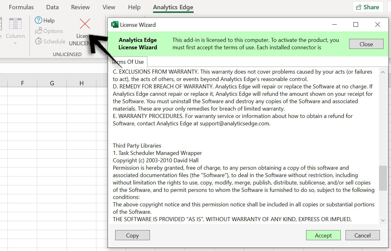
1. Activate Analytics Edge
Once you have downloaded and installed the add-on, you’ll need to connect it to your Google Analytics account. To do so, in the main ribbon area, in the “Analytics Edge” tab, click on the red “License UNLICENSED” cross, and then accept the Terms of Use.
2. Connect Analytics Account & Property
Then, connect your Google Analytics account by clicking on the “Add Account” button, select your property and view near the bottom of the screen, and click “OK“.

You can also choose to set this account as the default with the “Make Default” button. This will save you some time whenever you need to refresh the data.
3. Choose Your Export Settings
Go back to the main Excel ribbon, and click on “Free Google Analytics“, and then click on “Analytics Reporting”.

In the next window, you’ll choose the settings of the report you want to extract from Google Analytics. We’ve broken it down for you, and included some images in the slideshow below.
- Select Your View: this is the view that will have the data you want to extract. If you have a user-id property, this is the one you want.
- Choose Your Fields: these are the dimensions and metrics you’ll download. As for dimensions, enter “Date” and “Client-ID” (or User-ID, ideally). As metrics, you’ll want “Transactions” and “Revenue“.
- Add Filters: in this tab, exclude all hits without transactions. In other words, add a filter that includes only “Transactions > 0”. (See image)
- Select Dates: use the calendar to select the dates needed. Note that if you select long timeframes, Analytics Edge may not be able to process all the data and you may need to download the data several times, with shorter timeframes.
- Options: last but not least, in the “Options” tab, check the two boxes for “Minimize Sampling” and “Warn if results contain sampled data“.
Click “OK” and wait for the data to be extracted (it can take a few minutes).


Calculate Date Differences Between Transactions
We’re almost there.
To finish the spreadsheet, you’ll need to add some new columns to calculate the difference between the transaction dates, for each user. To do so, we’ll use some simple Excel functions.
If you don’t want to build this spreadsheet yourself, you can access ours in this link and skip this next part until “Building Your Cohorts“.
To start, sort the dates from the extracted data by “Oldest to Newest“, and then by Client-ID, “Sort A to Z“. Do not skip this step, otherwise it won’t work.
Then, we’ll add 5 additional columns to the spreadsheet.

1. Purchase Frequency
Now that you’ve sorted the “Client ID” column from A to Z, we’ll use an “If” function to find if the transaction in the cell above is from the same user (or the same client ID, in this case).
In cell “E2“, for instance, the value is “2” because the cell above “B2” is the same value. If it wasn’t, the cell value would default to “1“. The same can be seen in cells “B5” and “B6“.

2. Join Date
This column refers to the first instance where a user has completed a transaction. In other words, it matches to the first date a customer placed an order.
This function looks for the value “1” in column “E” we created in the previous step, and returns the date in column “A“. In case the value isn’t “1“, it defaults to the cell above (which will always be the first transaction date for that user).

3. Cohorts
This column is the easiest one in the bunch.
We’ll use a simple “Text” function to retrieve the month in which the first transaction occured, so we can use the month in our Pivot Table, and calculate the amount of first transactions in each month.

4. Age by Day
Now, all that’s left is to calculate the date difference (in days) from the “Join Date” to the “Transaction Date“. To do so, we’ll use a “DateDif” function as demonstrated below.

For instance, in cell “H2“, the value is “1” which means that this transaction was made only 1 day after the first one. In cell “H6” the value is “62“, which means this transaction occured 62 days after the first one.
You get the idea.
5. Age by 30-Day
In this last column, we’ll sort the values from the “Age by Day” column into different 30-day slots.
In other words, transactions that occurred for the first time (Age by Day = 0) will be assigned a value of “0“. Transactions that have occurred up to 30 days after will have a value of “1“, transactions that occurred between 30-60 days after will have a value of “2“, and so on.
To do this, we’ll use the “vlookup” function.
However, before we can use this function, we still have to create a different sheet with 2 columns: “Days” and “Time Slots“. Since in this case we extracted data for a full year, we added 365 days to our first column. If you want a cohort for longer dates, you’ll need to add more days.

We then add different time slots so we can group transactions into 30-day segments.
Once that’s done, we can use our “vlookup” to reference the data in this sheet, and sort our transactions into different 30-day groups.

In other words, if the difference in dates between the “Join Date” and the “Date” columns is between 1 and 30, the value for this column should be 1. As we can see in cell “H6“, since the transaction occured 62 days before the first one, the “Age by 30d” has a value of “3”.
Now that the spreadsheet has all the needed data, we can build our Cohort Tables.
Building Your Cohort Tables
Now, all that’s left to do is to create the cohort table with the assistance of a Pivot Table.
To do so, click on the “Insert” button in the main Excel ribbon, and then on “Pivot Table“. Make sure to select the data in the entire table, and hit “OK“.

Then, we’ll add the “Cohorts” column as Rows, our “Revenue” as Values, and the “Age by 30d” as Columns. We now have our cohort table built.

Average Out The Cohorts
To finish the table, we like to move the data into another table on a separate sheet (not a pivot table). This makes it easier to read the data by including averages under each 30-day segment.

To do so, simply copy the values in the pivot table and paste them into another table, on a separate sheet. Then, under each column, add the values for the total users in each “Time Slot” and calculate the revenue from each user, as well as the increase from the first order.
In this case, we can see the LTV increases by nearly 23% in the first 60 days after the first order was placed. Not much, but it can point us in the right direction as to what should be done to increase these numbers.
- Can we run an email marketing campaign to increase repeat purchases?
- Is there any specific offer that has a higher customer lifetime value?
Bonus: Additional Dimensions
Here’s another quick tip.
When you extract the data from Google Analytics Edge, you can also add more dimensions other than the date, and client ID. For instance, you can add the “Default Channel Grouping” dimension so you can further break down the cohorts by channel, too.

This will enable you to see which channels drive customers with the highest LTV.
Cool, huh?
Conclusion
Sure, there are other (simpler) ways to build these tables. However, most of them need some additional software or tools which will result in more costs for you.
If you’re looking for a quick alternative to come up with some approximate projections, this is a decent alternative.
However, as mentioned in this article, the “Client ID” isn’t the ideal dimension to build these tables since the identifier actually refers to specific devices or browsers, and not real users. Whenever possible, use the “User-ID” dimension for more accurate data.
If you’re on Shopify or WordPress, you can find different ways to export the sales data into a spreadsheet and run the same exercise. However, Google Analytics does provide you with the flexibility to add more dimensions into your cohort table, as seen in the image above, and see the data under different scopes.
To finish, this post was largely inspired by these two articles, so full credit where it’s due. 👏
- How to do your Cohorts analysis in Spreadsheet & Excel (A detailed guide)
- Customer Lifetime Value for Ecommerce: A New Definition Beyond LTV:CAC for Limitless Scale
What did you think about this article? Had any trouble with the Excel table?
Let us know in the comments below, or reach out to us via Twitter or E-Mail and let’s talk!


1 comment
Thank you for sharing such a detailed post on the calculation of customer lifetime value. It has significantly simplified my work.